
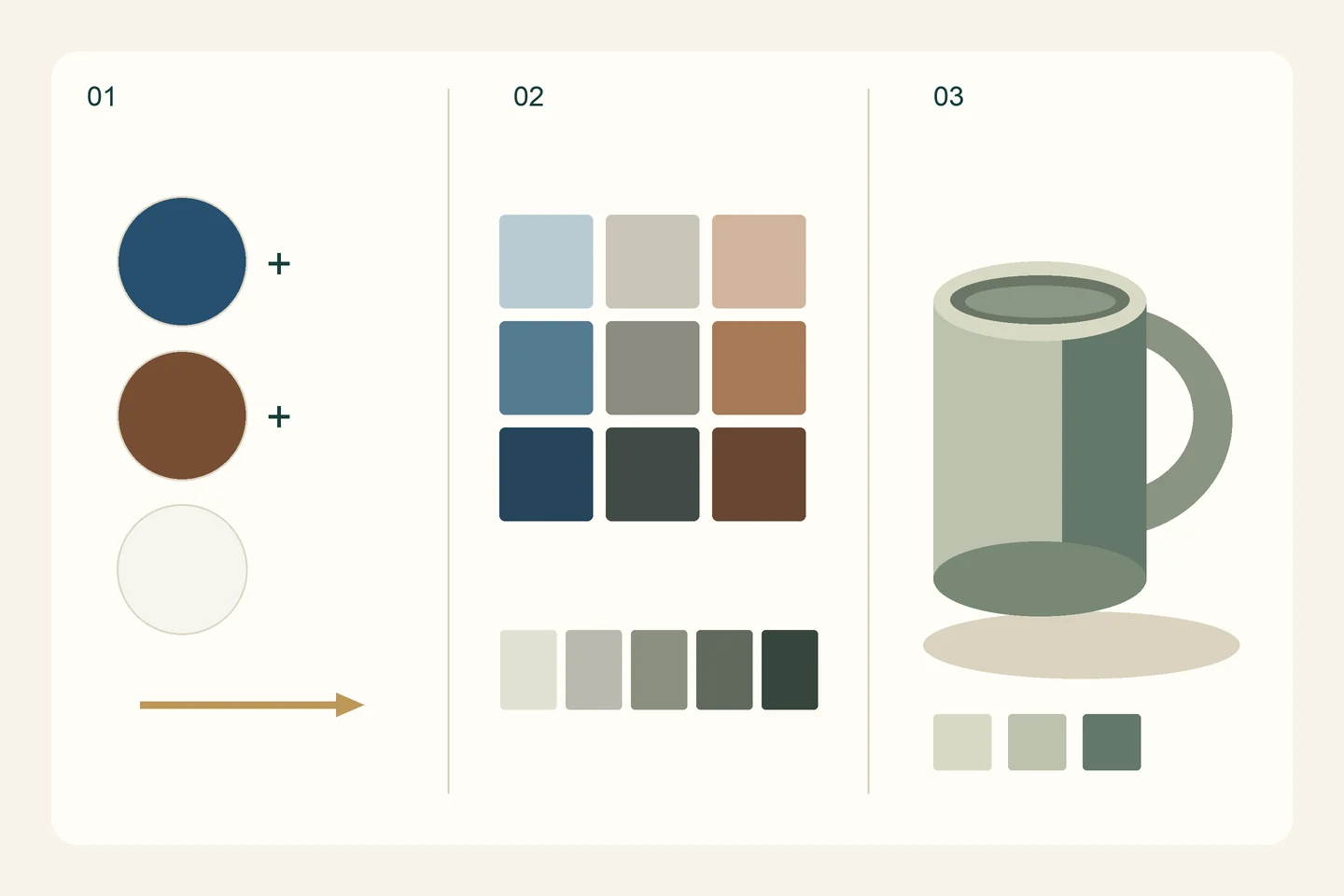
What you will learn
- Separate a value decision from a colour-direction decision.
- Make nine comparable swatches under consistent lighting.
- Build and review a cup study using three clear value masses.
Separate hue, value and saturation
Use three practical distinctions. Hue describes a colour direction, such as a blue tendency. Value describes how light or dark it is. Saturation describes its colour intensity relative to a quieter mixture. You may like a blue mixture but find it too dark for the illuminated side of a cup. Adding another colour without identifying the problem can make the decision harder.
We will limit the palette rather than begin with a complete colour wheel. Fewer variables make the effect of each addition easier to observe. This is a focused comparison exercise, not a claim that two pigments can mix every colour or replace a wider study of colour relationships.
Prepare a small palette and a stable subject
Set out ultramarine blue, burnt umber and titanium white from a suitable oil-colour range. You also need a palette knife, a medium brush, a mixing palette and a small oil-ready support. Choose a matte, neutral-coloured cup with a simple background and keep one light source steady. Different pigments and brands behave differently, so treat each mixture as a test rather than a guaranteed ratio.
Whites differ in covering and tinting strength. Add titanium white in small increments and compare the result before adding more, particularly when you want to retain a distinct colour character. Winsor & Newton: choosing white oil colour
Follow product instructions for handling and cleanup. Keep food and drink away from your materials and wash your hands afterwards. Some oil colours can be used straight from the tube; solvent is not automatically required for this exercise. If you use an additional product, follow its own ventilation, handling and disposal guidance. Gamblin: studio materials and safe working practices
Make a chart before painting the cup
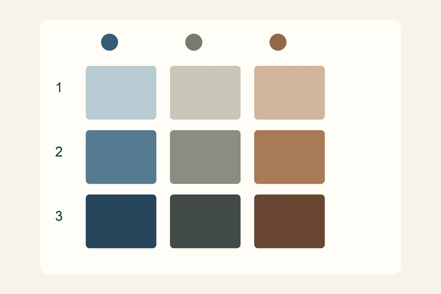
Divide a test area into nine spaces: three columns and three rows. Keep the samples small and leave clean mixing space for each colour family. Wipe the knife between additions so that an unintended colour does not become another variable.
- For the first column, add a very small amount of brown to blue while retaining a visibly blue tendency.
- For the second column, adjust a separate sample gradually towards a quieter, more neutral mixture. Perfect grey is not the goal.
- For the third column, make a brown-leaning mixture. Compare it directly with the first column so that their difference remains clear.
- Make three values for each column: a dark mixture, a middle mixture with some white, and a lighter mixture. Transfer fresh portions rather than altering the original dark pile.
- Record the paint names and the direction of your adjustments. Notes about what changed the result are more useful than a guessed numerical ratio.
Turn your mixtures into three value masses
Keep your viewpoint fixed and lightly place the cup and its cast shadow. Simplify the subject into a light, a middle and a dark mass. The background may need a separate value, but begin by organising these three within the subject instead of following every small reflection.
Choose the closest chart sample for each mass. Apply a small area and compare it with its neighbours before extending it. A mixture that looked suitable on the palette may appear lighter or bluer against the background. This is a reason to compare colours in context, not evidence that mixing has failed.
Keep the light-to-shadow relationship readable. Do not soften every boundary immediately: decide where you observe a gradual transition and where an edge or cast shadow is clearer. Once the three masses are placed, pause before adding decorations, tiny highlights or surface texture.
Diagnose a mixture before adding more paint
If a mixture looks muddy, make a fresh sample on clean palette space using only the two starting colours. Compare it with the previous sample. Colour carried by the knife or brush, or repeated opposing adjustments, may explain the difference. Brown is not inherently a mistake; a subdued mixture may be exactly what the subject needs.
If the light area looks chalky, review its white content, value and colour intensity before adding more. Test a small portion instead of covering the whole area again. If the cup still looks flat, return to the value relationships and the shape of the shadow. More detail will not repair an unclear value structure.
If one dark colour overwhelms the mixture, begin with more of the colour you want to preserve and add the stronger colour with the tip of the knife. You do not have to rescue every large pile. Testing a small portion reduces waste and makes comparisons easier.
Review the result, then change one decision
Place the chart beside the study. Can you distinguish the three masses from a distance? Is the illuminated area lighter than the shadow? Can you identify a relatively cooler mixture and a warmer one? Have you made notes that would help you recreate a similar sample in another session?
A greyscale photograph can help you compare values, but it is a supporting check rather than a final verdict: phone exposure and lighting can alter relationships. Also review the painting directly under the same light. Write down one specific adjustment, such as a slightly darker shadow or less white in the middle area.
Repeat the same cup with the lighting, scale and tools held steady, changing only that decision. Keeping both studies makes the comparison concrete. Once the value masses read clearly, try a piece of fruit or another vessel rather than immediately adding a crowded arrangement.
Frequently asked questions
Do blue and brown need a fixed mixing ratio?
No. Pigments and tinting strength vary between products. Add small quantities, record the direction of each adjustment, and test the sample beside the colour you are comparing it with.
Can I practise the idea with acrylic paint?
You can practise value and colour comparisons with acrylics, but drying time, handling and cleanup differ. Use an appropriate support and materials, and do not treat oil-painting instructions as universal instructions for every medium.
When should I try a complete painting?
Once you can distinguish light, middle and dark masses and explain a specific mixing adjustment, try a small two-object composition. You do not need to master every possible colour before continuing to learn.
Continue learning with the academy
Choose a course for the skill you want to develop, and check its curriculum and lesson language on the course page.
- Oil Painting — For a broader learning path, review the Oil Painting course curriculum and its materials. This is an independent exercise, not a promise that the same cup project appears in the lessons. Check the course page for the current recording language.